![Game Pieces]()
Game PiecesWhen I joined the production the team had settled on the design of the game pieces on the left, made by the talented Meg Zavala. However in game the pieces weren’t “juicy” or vibrant enough. They also seemed too flat and 2 dimensional compared to the 3D character and world. I redesigned the look of the main pieces (right), simplifying their look and structure to be more readable. I also redesigned the rainbow snowflake and Meg was able to to take this direction to create a more polished set of “special” pieces ( The ice bomb, butterfly and line clear on the left). This exemplifies a lot of what i did on the project, guiding the art team to reach a new level of polish.
![Shading]()
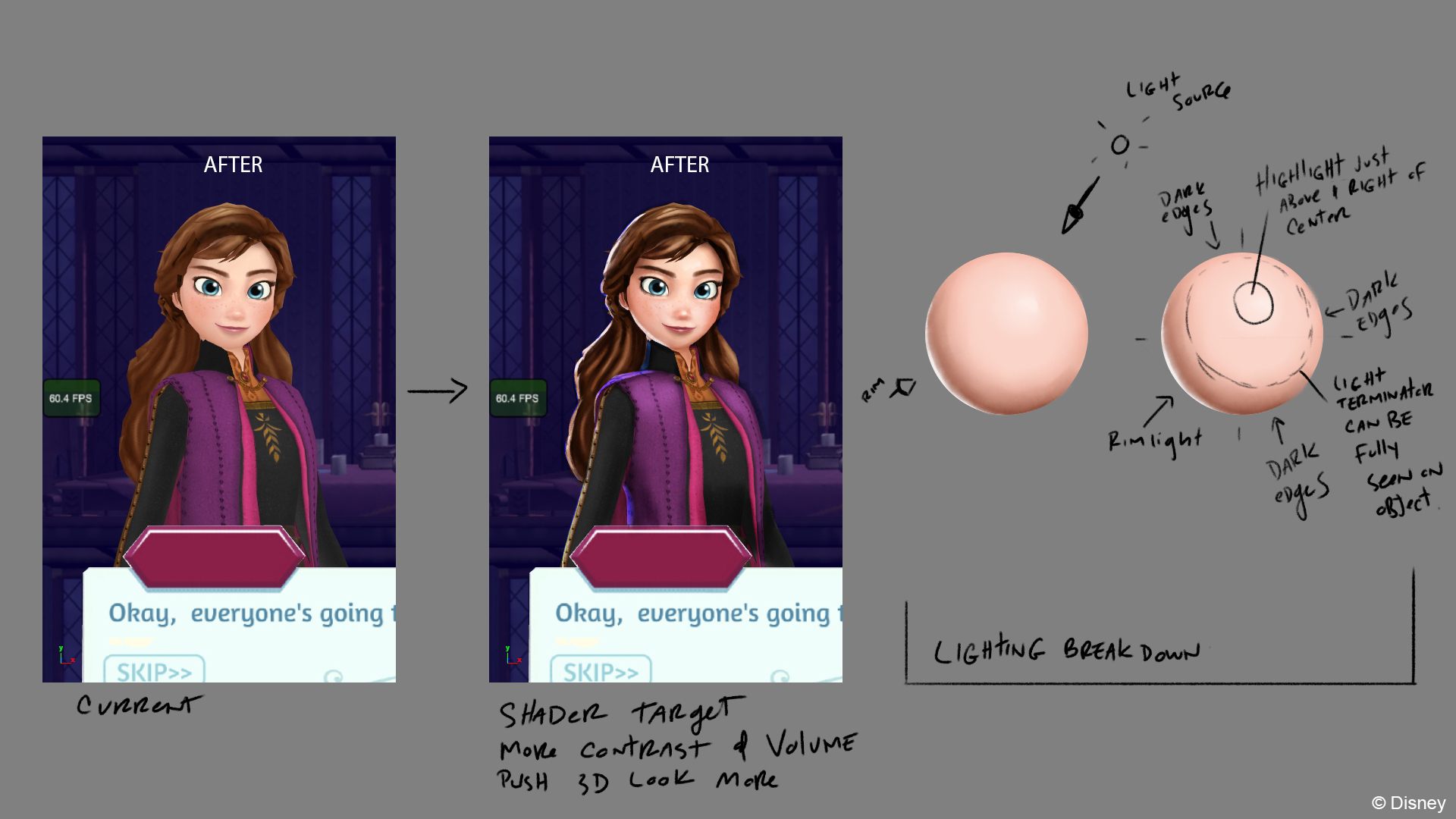
ShadingAbove are notes given to the Tech Art team on how to improve the look of their character shader. The characters are all 3D but the shader was making them look a little flat. Above is a paint-over I made to give the team a target to hit. Showing the qualities we needed in a sphere painting was important because the team was using Matcap shaders. So I knew that ultimately we needed a stronger base texture for our capture sphere with more contrast to make the character pop more off screen.
![Above is a before and after showing the shader improvements. Credit goes to Tech Artist Kristin Weeks and 3D artist Debbie Kim for the final results.]()
Above is a before and after showing the shader improvements. Credit goes to Tech Artist Kristin Weeks and 3D artist Debbie Kim for the final results.
![Here was a mockup of the game with the old game pieces and character shader.]()
Here was a mockup of the game with the old game pieces and character shader.
![Above you can see the two changes makes the game feel much more 3D and vibrant. The pieces feel more tactile and appealing.]()
Above you can see the two changes makes the game feel much more 3D and vibrant. The pieces feel more tactile and appealing.
![]()
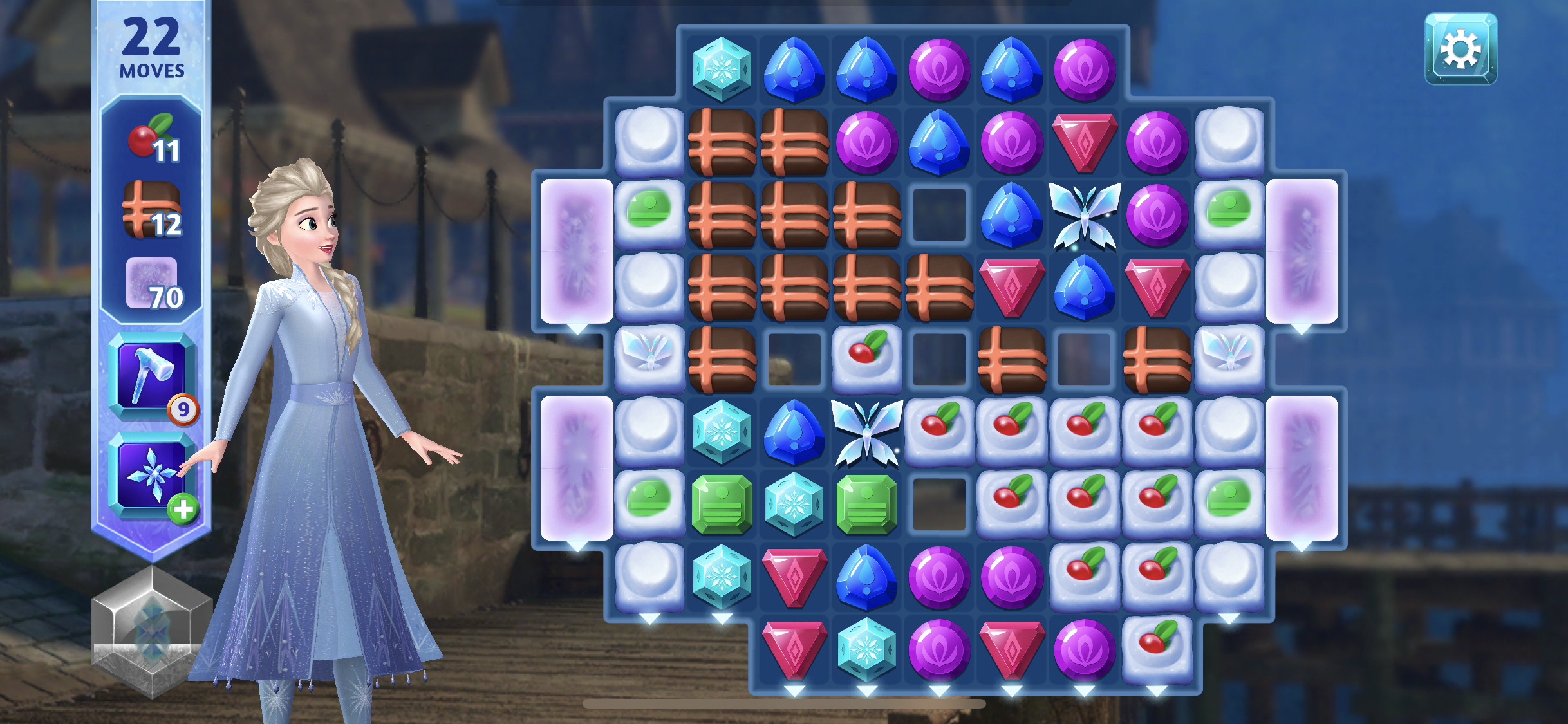
Above is how the final game looked with a number of mechanics on the game board.
![Locations]()
LocationsThe next big area of focus was improving the starting location of the game. The story begins at the Arrendelle castle entrance. The original setting (above) was focussing too tightly on the front door which is enclosed in the castle walls. This meant that the opening of the game was set in a cramped location that wasn’t too inviting for players. It also didn’t do justice to the beautiful rooms the team was designing.
![Revised Castle Entrance]()
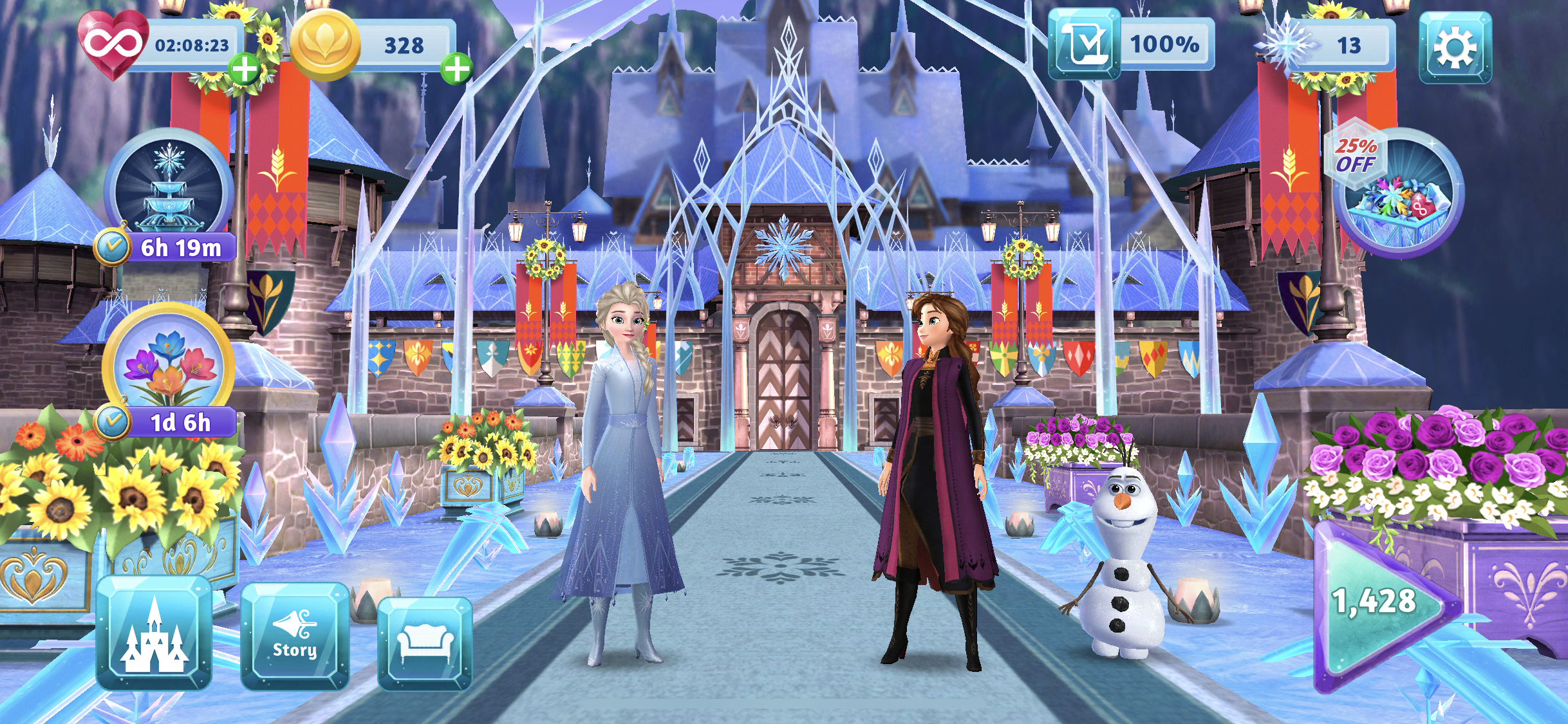
Revised Castle EntranceI worked with the team to reset the opening location to the bridge leading into Arrendelle castle. This change gave the opening a more grand and exciting feeling. This composition narratively allows Anna and Elsa to welcome the player into the larger world of Arrendelle. It also allowed the decoration elements ( banners, candles etc…) to have more space to feel like impactful player choices.The team did an amazing job rallying to improve this location for our World Wide launch.
![Above is a look at the castle bridge location in its final state, covered in magical ice with lots of decorations.]()
Above is a look at the castle bridge location in its final state, covered in magical ice with lots of decorations.
![Royal Kitchen]()
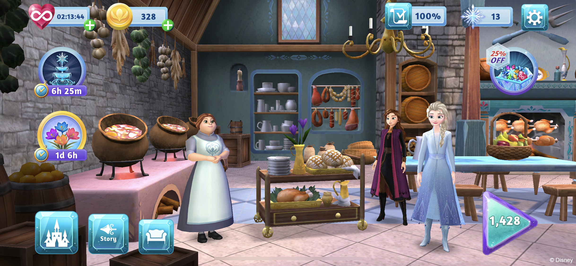
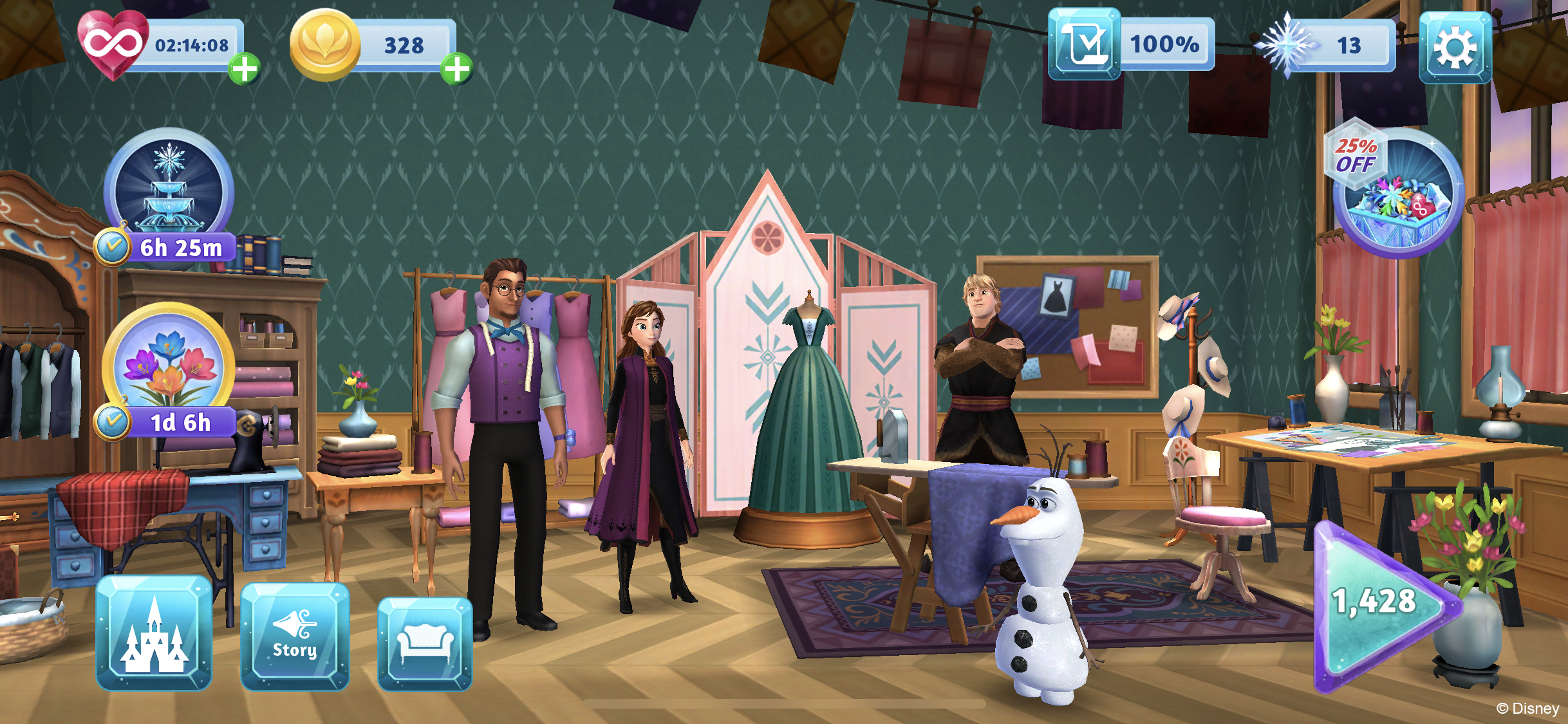
Royal KitchenThe next series of images shows off some of the beautiful locations our team made for the game. I art directed these locations and revised our production pipeline so they could be produced more efficiently by our amazing team. Designed by Gia Park. Modeled by Debbie Kim
![Dress Shop]()
Dress ShopDesigned by Emil Salim. Modeled by Miguel Vasquez
![Great Hall]()
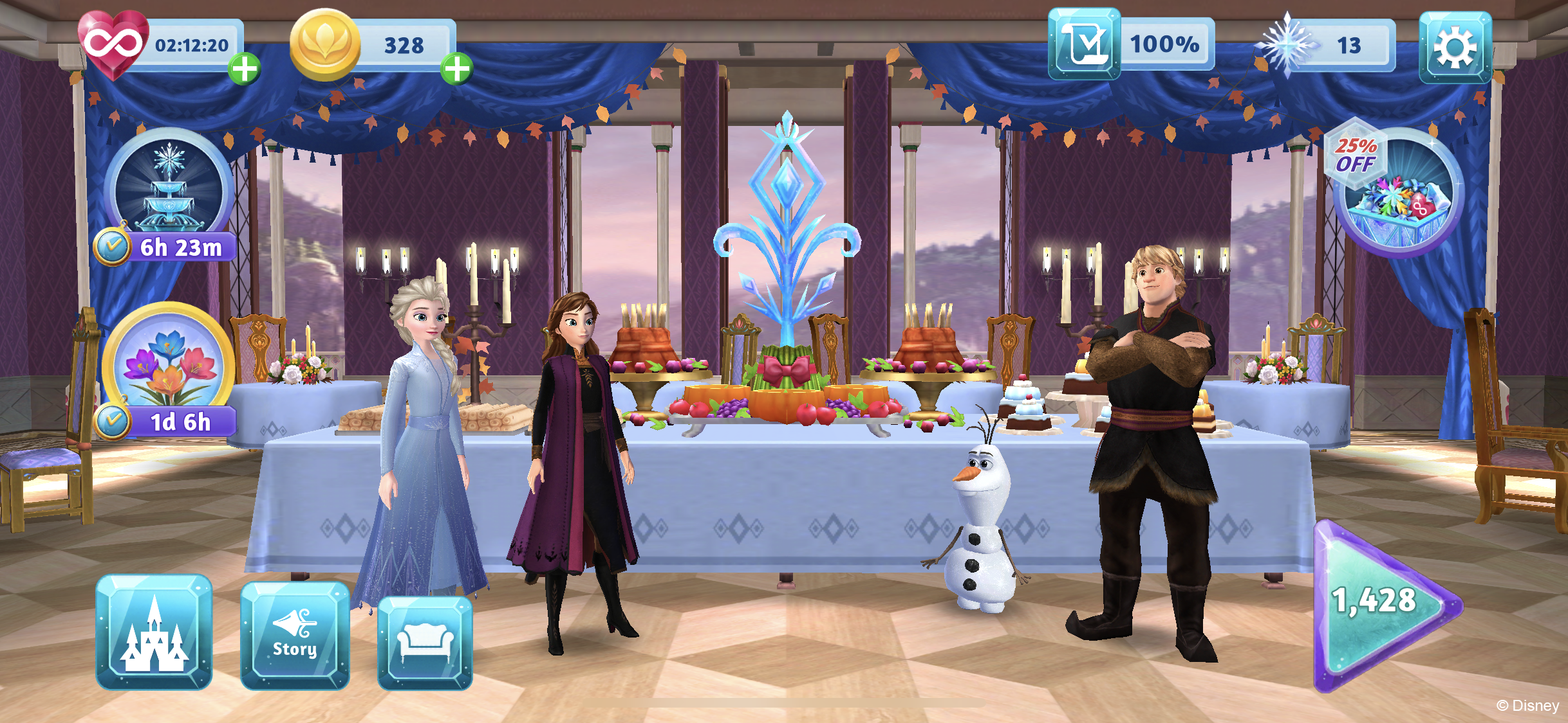
Great HallDesigned by Emil Salim, Meg Zavala and Gia Park . Modeled by Debbie Kim
![Troll Valley Concept]()
Troll Valley ConceptThis location appears in quests and it is the iconic home of the Trolls from the first film. I got to provide the concept for this location myself as the artists were busy with other locations.
![Game Mechanics]()
Game MechanicsA big area of focus on the game was designing new puzzle mechanics. Each new mechanic had to be designed to be readable and tactile to match the boards 3D aesthetic. A good mechanic should telegraph its goal to the player without explanation. These AD notes were for the development of the candles mechanic. When a player matches next to a candle it illuminates an area of the board. I worked closely with Meg Zavala to refine the design of the candles to more closely match the croquis design seen throughout Frozen’s world. I used 3D to mock up the candle’s perspective and to give her a stronger guide for how to handle the perspective of such a complex shape.
![Candles / Darkness Final Design]()
Candles / Darkness Final DesignThe final mechanic was beautifully painted by Meg Zavala. The candles have a neutral cold resting state, but when activated they give off a warm light that unlocks parts of the board hidden by the darkness grid spaces. I love how believably it sits on the board with the other pieces. Meg did a wonderful job not just on this design but also on figuring out all the intricate parts that made up the tile-able darkness pieces.
Above you can see the candles in action. Captured in editor.
!["Splitters" Or Elemental Fire]()
"Splitters" Or Elemental FireAnother mechanic I want to highlight is “Splitters”. The idea here was that there would be a small fire on the board, when the player matched next to it the fire would split in two and be re-propagated onto the board. It would do this twice before it could be cleared from the board. In the above concept I established the readability of each stage ( 1. Opening State Largest fire, wild movement 2. Middle State smaller fire more controlled 3. Final State A low simmer). We leaned on not just color changes but different movement and shape languages to communicate the change to players, to simulate the idea that with each step the fire was dying down. The shapes at the top where meant to indicate what types of base particles could make up each stage since the mechanic was very FX heavy.
![Taking that base concept, Meg did a wonderful design pass on the final mechanic that would then be handed over to our animators Rita Yeung and Dave Markowitz to animate in engine.]()
Taking that base concept, Meg did a wonderful design pass on the final mechanic that would then be handed over to our animators Rita Yeung and Dave Markowitz to animate in engine.
In this Dev video you can see the “splitters” mechanic in action. Rita and Dave did a great job with the animation of the idling fire and the jumping motion.
Here is another in editor view of “splitters” in action as well as a look at a number of other game mechanics. This was a very FX heavy mechanic and I am really proud of how are team was able to make the fire look so organic while retaining the important readability qualities needed in a strong puzzle mechanic. The whole game came together beautifully and I think honors the rich visual identity of Frozen while also looking like a competitive casual mobile game.


